I’ve been really trying to avoid posting about our home-buying situation, because it’s still kind of up in the air, and I’m very superstitious. It seems like every time I mention something publicly before it’s set in stone, the situation ends up falling apart.
But things are going to continue to be up in the air for at least another month, and I can’t keep my mouth shut any longer! So here it is: We found a house. We made an offer, and it was accepted. If all goes well, we should be closing in the next 30-ish days.
I can guarantee you this – I’ll be paranoid and superstitious until we have the keys in our hands. But at some point, we have to start making plans. So, for now, I’m trying to think about low-commitment plans that could be applied to any new home we end up in. Paint colors!
In the past, Brad and I have always chosen to go bold. Our current home has a deep charcoal in the bedroom, a bright sunshine yellow in the living room, and turquoise in the foyer. You can see the latter two in this post. We love fun colors – my foyer genuinely makes me happy every time I step into it. But when you start thinking about living in a house for an extended period of time – hopefully at least five years, if not 10 – bold starts seeming a little more intimidating. Especially when you’re embracing an open floor plan that would require the same color to coat the living room, downstairs hallway, stairway and upstairs hallway.
I’ve actually been thinking more about neutrals lately, anyway. I don’t regret the color of our foyer, because it has very little furniture and is an isolated room. But the bright yellow in our living room has really limited my design options in there. I’m learning to love rooms that feature neutral walls with throw pillows, blankets, artwork and accessories lending the pops of color. Smaller items are so much easier (and cheaper) to change out when you get bored!
We’re leaning toward a pale gray as our neutral. Not a blue-gray, or green-gray, or even beige-gray – I’m talking about a soft silver/dove/pearl gray. The only requirements are that it’s vivid enough for white frames and trim to pop against it, but not dark or saturated enough to make a statement on its own. Simple, right?
These are some of my favorites, so far.
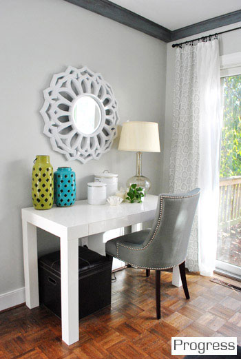
Benjamin Moore – Moonshine. Via Young House Love – they have this color all over their house! Here’s a post about how they picked it.
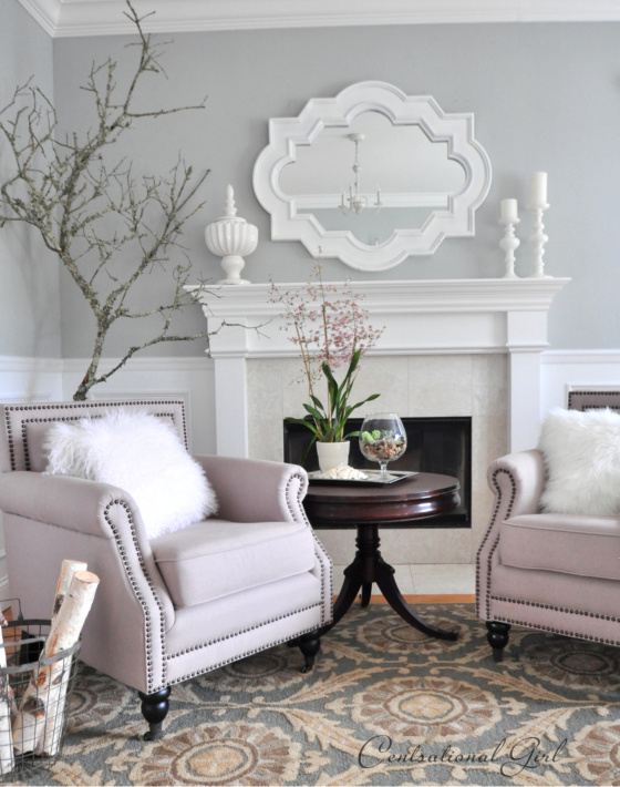
Benjamin Moore – Tranquility, but with some changes made to the formula. Via Centsational Girl. She kindly included the formula: S1 0x 3.0000; Y2 1x 1.5000; B1 0x 20.0000; O1 0x 19.0000. However, she also provided some similar colors: ‘Portico’ by Valspar, ‘Sea Salt’ by Sherwin Williams, and ‘Chicken Wire’ by True Value.
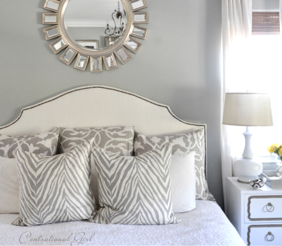
Another custom color – nooooo! But Centsational Girl provided a few color matches: Valspar’s ‘Clothesline Fresh,’ Glidden’s ‘Grey Leaf,’ and Sherwin Williams ‘Silver Mist.’
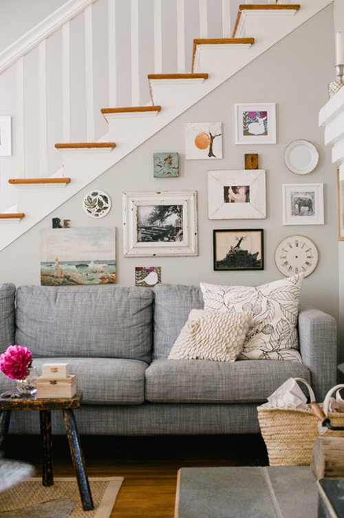
An unidentified shade! Sadface! This one is via Daily Dream Decor.

Benjamin Moore – Smoke. Via Hirshfield’s Color Club. Based on other photos, it looks like this one might be too blue, but I sure do like it in this picture.
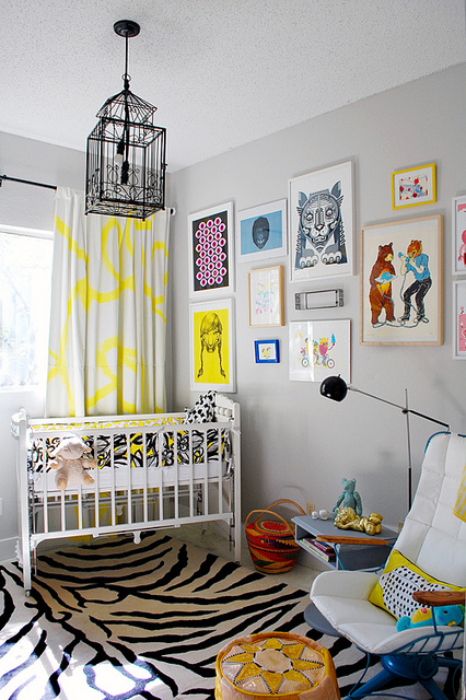
Benjamin Moore – Harbor Gray. Via Design Crisis.
I’m sure we’ll start finding other favorites when the search starts in earnest. I won’t be buying samples until after we close, though, thank you very much!
Which do you like best? If you had to pick one color for your entire home, what would you choose?

Hey Steph – I painted my condo in grey and love it. It is the new neutral color and it is so easy to design with. I think you will enjoy the change.
I love the Tranquility. Your grandmother who had great taste always used white on her walls to create “the gallery effect.” Even in the boring 70’s she was adding “pops of color” to her home. I think you can achieve the same effect with gray. Especially with your creative design sense!
I’ve been seeing a lot of white lately! I have to have dark furniture and finishes though, because I’m such a slob and am always spilling … Too much contrast. If only I could have a pretty peach couch like Mimi’s (that’s what color it is, right?).
They were a yellowy cream. My favorite room was our powder room which had black and white wallpaper and a red ceiling! But, she also had floor to ceiling drapes in her bedroom that had pink stripes. It worked without looking garish because she had white walls.
I’ll have to see your walls some time, Kim!
I have an infatuation with Moonshine. When you look at one of the large samples, it’s actually a pretty dynamic color. I also love the Harbor Gray. It seems soothing. Like a safe harbor (haha. Just kidding. I really felt the need to say that). But the color is awesome nonetheless.
I heard it’s SHIMMERY! I need to see it in person!
Shimmery, huh? So, I shouldn’t make Rob paint his gray semi gloss walls over?
I think there’s probably a difference between shimmery and glossy … But who knows??
I love all of those! I’m really drawn to super light grays – they’re so gorgeous.
I’ll definitely be taking cues from all your amazing gray decor!
We have an open floor plan too…. foyer,dining/living room and downstairs/upstairs hallway all really have to be the same color. It’s tough! We went with a bolder grey that has violet undertones… it felt really different at first, bc we were used to ecru walls, but now it makes the whole place feel warm and cozy and home-y! It also looks amazing with white furniture, and basically any color pillows/blankets/etc!
Good luck with the home buying!
Loooooooove grey-violet! I want to see pictures!!!
great choices, there. grays are so hard – try some large test swatches in your room – depending on the lighting – grays can change so! best wishes, donna
Good call! Thank you!
I painted my main floor Sterling by Benjamin Moore. It’s on their old fan deck. Perfect for me its a blue grey but not baby blue. You may like Revere Pewter from BM!